
Field, grid and light
One style for every DANBODD page. Dark and calm like an infrastructure investor, drawn like an engineer, and every number traceable like a DANBODD report.
Midnight carries the page, paper carries the reading
Navy and azure come from the DANBODD documents, blue and leaf from the logo. Green is for the one action that matters on a screen.
One family, every weight from 100 to 900
DANBODD Sans on the web is Albert Sans, a Scandinavian geometric face under the open font licence, in one 32 KB file. Headlines bold, reading text light, numbers thin. Nothing under 12 px.
The original marks, now in vector, and they move
Traced from the Illustrator master of 2021: the ring, the sky, the three leaves and the serif wordmark are the original outlines. DANBODD Analytics is rebuilt in vector from its raster. Where both marks sit side by side, their circles share one centre line.










One pen, one grid, one tag per object
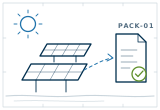
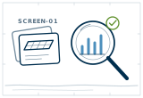
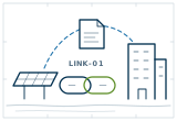
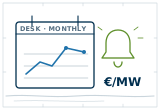
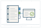
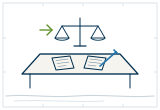
The door drawings and the offer plates sit on stone like a drawing on a sheet, and draw themselves once. The icons share the 64-unit grid and the pen of the DANBODD reports.


Slow to arrive, quick to answer
Reveals take 1.2 seconds on a calm curve. Buttons and links answer in a quarter of a second. Nothing loops except the living grid, and it stops when it leaves the screen. Reduced motion turns everything off.
Text rises from 5% to full strength.
A headline lifts 26 px into place.
1,700 GW
The two hairlines of every band grow from the top as the band arrives, like a drawing being ruled.
Power moving along a grid, drawn in under 3 KB of script. Used once per page.
Real places and real people, graded the same way
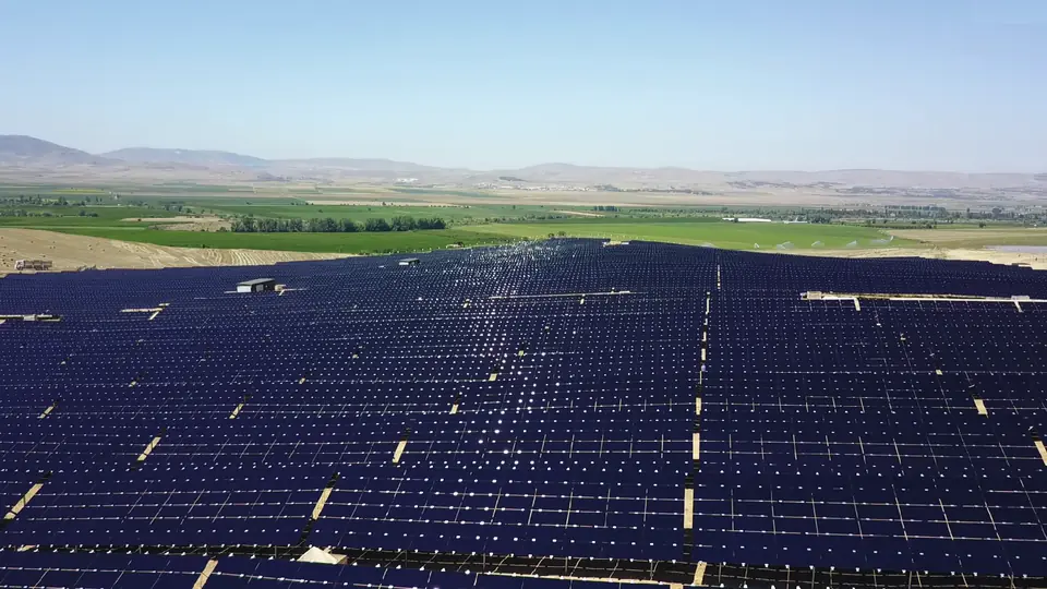
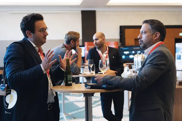
Our own plants, our own people, our own events first. Every image passes through one grade: colour down a tenth, blacks lifted towards midnight, a soft curve and a light vignette. People in graded black and white. tools/web/imagekit.py does it in one command and writes AVIF and WebP at three widths.
The rules every page keeps
- A page loads in under 400 KB before the first scroll, and under 1.2 MB in all.
- One family, one stylesheet, one script, no framework, no third-party tracker.
- One primary button per screen. Everything else is an arrow link.
- Photographs are ours or made to our brief, graded once, never stock clichés.
- Pen drawings explain, photographs prove, numbers persuade. Each has its place.
- Text never under 12 px, contrast at least 4.5 to 1, every control usable by keyboard.
- Every animation has a reason, runs once, and stops under reduced motion.
- The look of a world-class infrastructure investor, never its layout copied line for line.